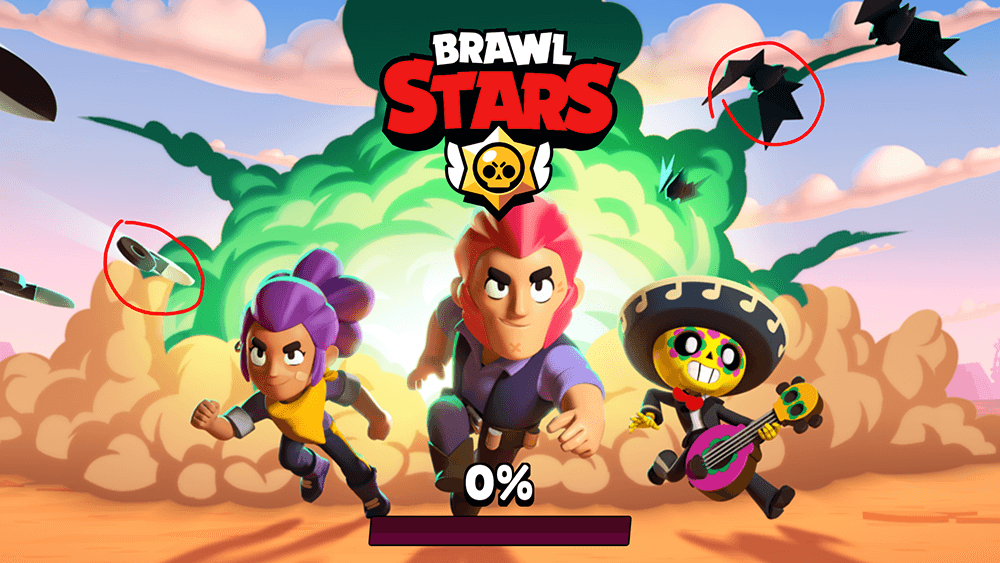
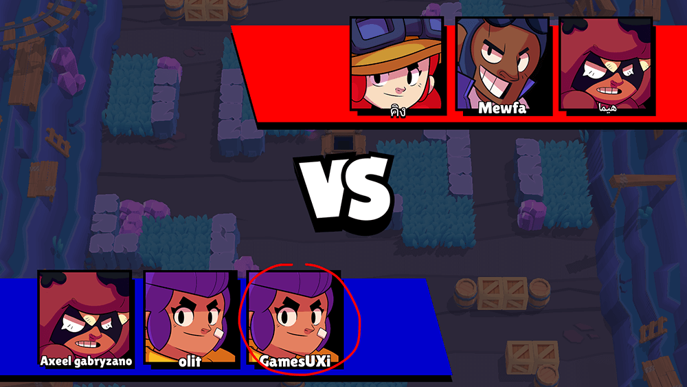
Brawl Stars’s loading screen is beautiful, with an impressive and dynamic perspective. Take the player into the Brawl Stars game spirit.
There are some elements that are not clear what they are.
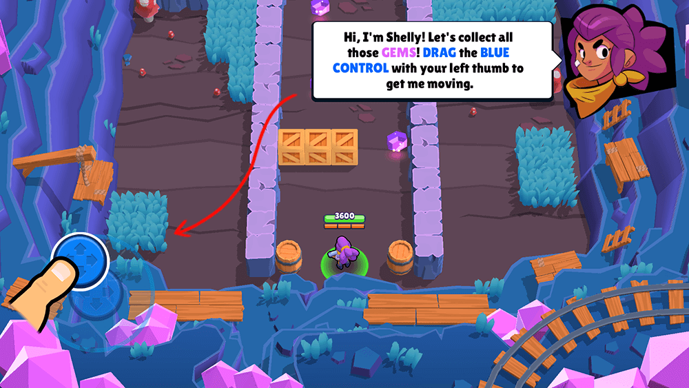
The learning screens are clear and fun first experiment, I would expect a clearer connection between the text and the action that the player is required to do.
The text could be arranged more easily & accessible.
Brawl Stars’s comic style
I really loved this comic style screen
The player’s position could have been more pronounced
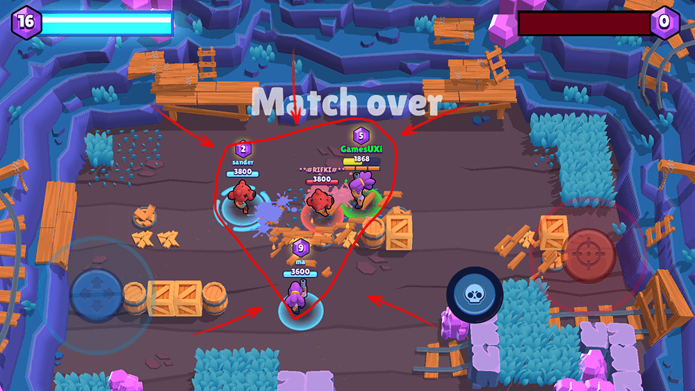
Brawl Stars’s game
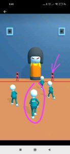
The game itself very crowded, a lot of information that the user can not absorb while concentrating on the game activities.
The experience feels too small & far and thus reduces and weakens the
sensation.
There is a lot of information in small size that makes it difficult for a mobile player.
In this screen you can see how the entire game is concentrated in the center of the screen and does not take advantage of the available space.
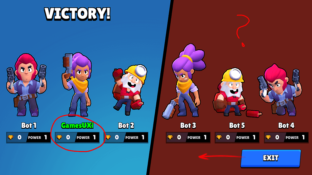
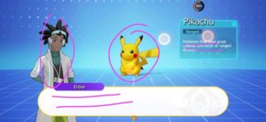
The division into winners and losers on summary screen is very good.
For the player it’s takes time to find himself.
I would expect to see “losers” title too, that strengthens the sense of victory.
This screen is divided into two, so the balance is in the center so I do not understand why the button is on the side.